Wayfinding signage is the system of signs that gets a person from the car park to the right room without asking anyone. Directional signs are one part of that system, the arrows and pointers, but wayfinding also covers building identification, floor plans, room numbering and exit routes.
Get it right and nobody notices it. Get it wrong and your reception staff spend half their day giving directions.
Britannia Design & Print designs, makes and installs wayfinding signage for Birmingham buildings. Offices, schools, clinics, care homes, warehouses, retail parks and multi-unit sites.
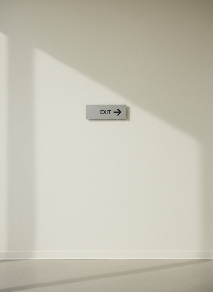
Directional signs tell you which way to go. An arrow and a word.
Wayfinding is the whole system, designed so the signs agree with each other. It includes identification signs (this is Building B), directional signs (Reception, this way), room and door signs (Meeting Room 3), reassurance signs along a long corridor, and regulatory signs like fire exits.
The reason the distinction matters: most buildings with a wayfinding problem don’t need more signs. They need the signs they’ve already got to use the same names, the same colours and the same logic. Adding another arrow to a confusing building usually makes it worse.
Four things, in order of how often they go wrong.
Consistent naming. If the car park sign says “Main Entrance”, the door can’t say “Reception” and the floor plan can’t say “Front Desk”. Pick one name per destination and use it everywhere. This is free and it’s the single biggest fix in most buildings.
Decision points, not corridors. Signs belong where someone has to choose, which means junctions, lift lobbies, stair heads and entrances. A sign halfway along a corridor with no turnings is decoration.
Readable at the distance people read it from. Text height has to match how far away the reader is. A sign designed to be read from 2 metres is useless at the end of a 20 metre hall.
Contrast. Dark text on a light panel, or the reverse. Low-contrast signage looks elegant in a brochure and fails completely for anyone with limited vision, including a large chunk of ordinary older visitors.
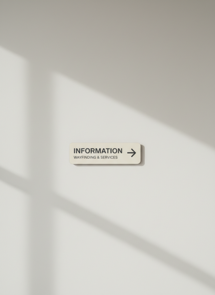
Wayfinding isn’t purely a design exercise. In buildings used by the public there are standards you’re expected to meet, and for good reason.
The relevant guidance in the UK includes Building Regulations Approved Document M on access to buildings and BS 8300 on the design of an accessible built environment. Between them they cover things like visual contrast between the text and its background, contrast between the sign and the wall it’s on, mounting heights, and where tactile or braille signage is needed.
Fire safety and escape route signage is separate again and follows its own standards, with the familiar ISO 7010 symbols.
We’ll design to these, but we’re a signmaker rather than an access consultant. On a large or public building, or anywhere the compliance risk is real, get an access audit done and we’ll work to it.
Any building where a visitor might get lost, and that’s a lower bar than people think.
Offices and business parks. Multi-tenant buildings especially, where reception is often shared and unstaffed.
Schools and colleges. Parents’ evenings, open days, visiting staff, new students in September.
Healthcare. Clinics, dental practices, GP surgeries and hospitals. Patients are often anxious, sometimes in pain and frequently not reading carefully. Hospital signage has to work for people at their worst, not their sharpest.
Care homes. Where signage does real work for residents with dementia, using strong contrast, clear symbols and consistent colour coding by floor or wing.
Warehouses and industrial units. Deliveries going to the wrong gate costs you money every single time.
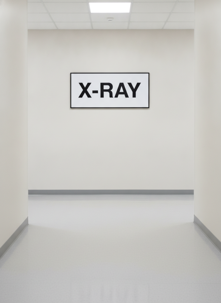
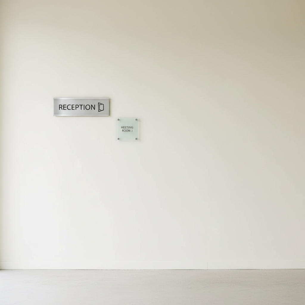
If you occupy one floor with a single entrance, probably not. A reception sign and door plates will cover it.
You need proper directional signage once any of these apply: more than one floor, more than one tenant in the building, visitors arriving without an escort, a car park that isn’t obviously connected to the entrance, or staff regularly being interrupted to give directions. That last one is the tell. If people keep asking, the building is asking you for signs.
Contrast beats colour every time. The test isn’t whether it looks good on a screen, it’s whether the text still reads when you squint at it from across the room.
Dark text on a light background is the most readable combination for most people and works well under most lighting. Light text on dark reads well too, provided the contrast is strong.
Colour coding by zone, floor or department works well in bigger buildings, but only if the colours are distinct enough to tell apart. Avoid relying on red and green to carry meaning on their own, since a significant number of people can’t reliably distinguish them. Pair every colour with a word or a symbol.
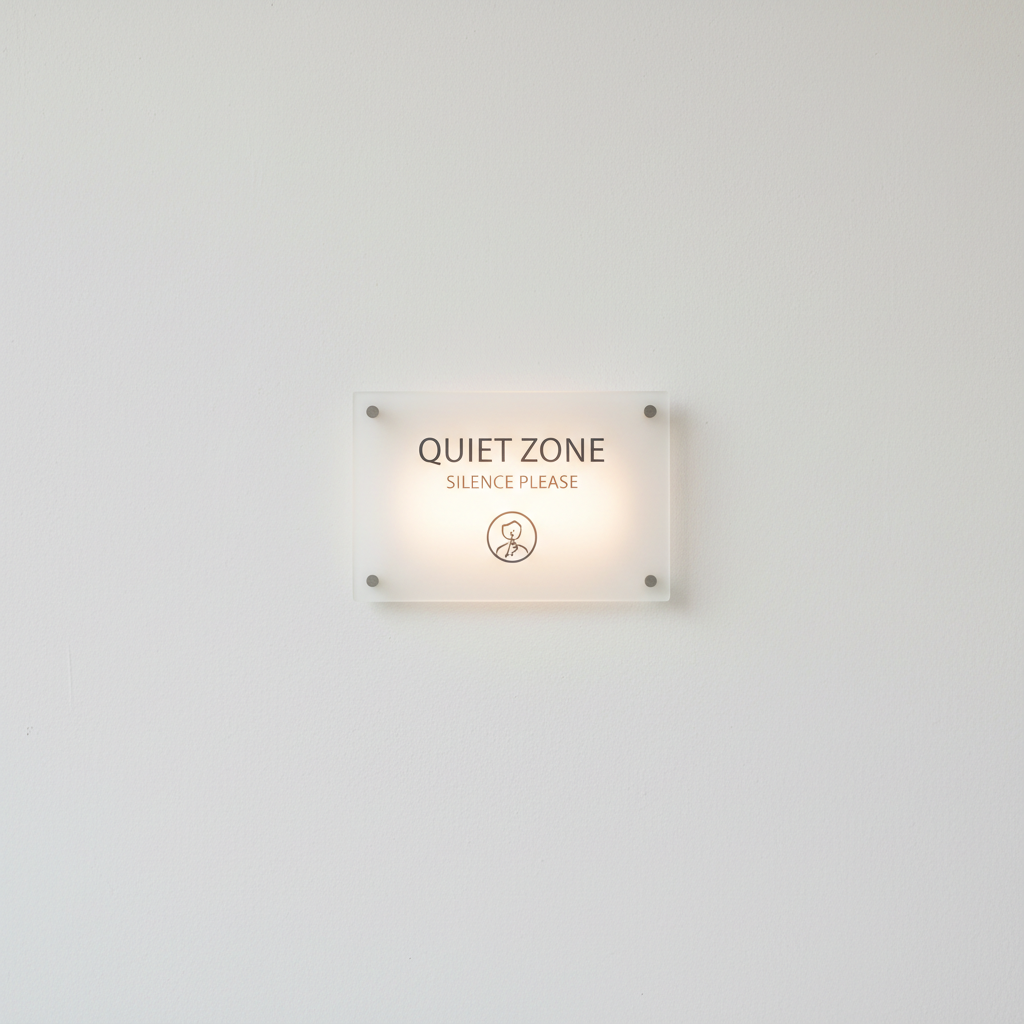
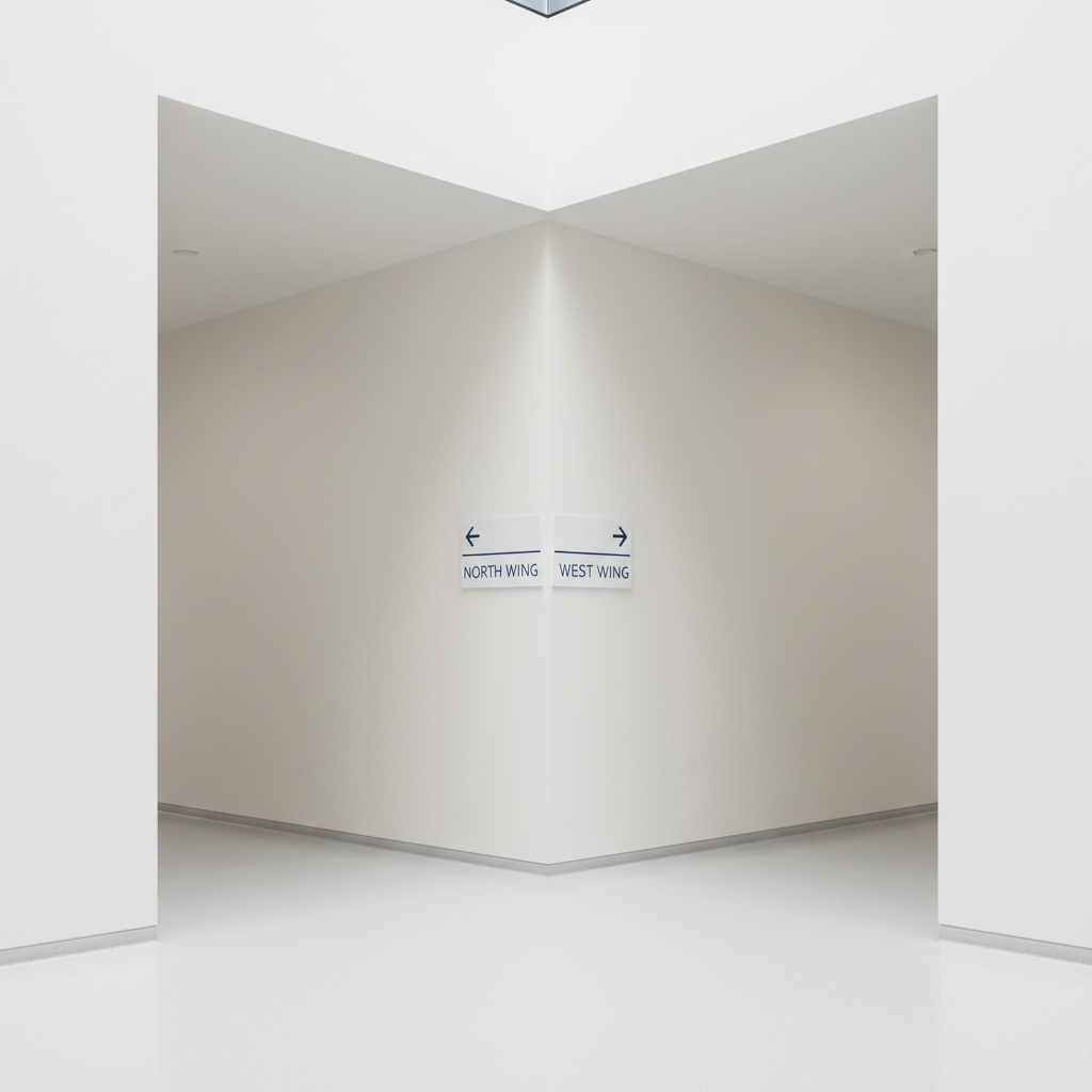
At every point where someone has to make a decision, and nowhere else.
In practice that means the site entrance and car park, the building entrance, the reception area, every lift lobby and stair head, every corridor junction, and the doors themselves. On long routes, add a reassurance sign partway along so people know they haven’t gone wrong.
Mounting position matters as much as location. Overhead or high-level signs for long sightlines, wall-mounted at eye level for decision points, door-mounted for identification. We work this out by walking the route the way a visitor would, which is normally the first thing we do on site.
A coordinated system of signs that helps people navigate a building or site, covering identification, directional, room and regulatory signage designed to work together.
Directional signs point the way. Wayfinding is the complete system, including identification, room numbering, floor plans and reassurance signs, designed so all of it uses consistent naming and logic.
It reduces the time staff spend giving directions, removes stress for visitors, and in healthcare and education settings it directly affects whether people arrive on time and in the right place.
Offices and business parks, schools, hospitals and clinics, care homes, warehouses, retail parks, leisure centres and any multi-tenant or multi-floor building.
Consistent naming across every sign, placement at decision points, text sized for the viewing distance, and strong visual contrast.
Yes. Colours, fonts, logo and materials are all matched to your brand and building, and inserts can be made changeable where names update frequently.
Single-floor offices with one entrance usually don’t. You need them once you have multiple floors or tenants, unescorted visitors, or staff constantly being asked for directions.
It’s priced as a system rather than per sign, because the design work is much the same across the set. Sign count, materials and mounting method are what set the figure.
Whatever gives the strongest contrast between text and background. Dark on light is the most reliable. Never rely on colour alone to carry meaning, always pair it with a word or symbol.
At decision points: site and building entrances, reception, lift lobbies, stair heads and corridor junctions, plus reassurance signs along long routes.
Posted on GoogleTrustindex verifies that the original source of the review is Google. Great Service as always Pizza ChefPosted on GoogleTrustindex verifies that the original source of the review is Google. Excellent ServicePosted on GoogleTrustindex verifies that the original source of the review is Google. Excellent ServicesPosted on GoogleTrustindex verifies that the original source of the review is Google. Fantastic experience working with Britannia Design & Print. Their web design and digital marketing team helped improve our online presence, and the results have been great.Posted on GoogleTrustindex verifies that the original source of the review is Google. The website they created for our business is professional, fast, and easy to manage. Thanks to their work, we now handle appointments directly and keep more profit instead of paying marketplace fees. Highly Recommended.Posted on GoogleTrustindex verifies that the original source of the review is Google. Excellent website development service. Britannia Design & Print helped us build our own online presence and reduced our dependency on commission-based marketplaces. The staff were very professional throughout. Highly Recommended!Posted on GoogleTrustindex verifies that the original source of the review is Google. Excellent customer service from the whole team. The boss was very approachable and genuinely cared about delivering quality work and keeping customers happy. Highly Recommended.Posted on GoogleTrustindex verifies that the original source of the review is Google. Great Service with quality work. Must try.Posted on GoogleTrustindex verifies that the original source of the review is Google. Excellent Services, They took my hand written my menu draft and turned into a professional and creative menu in few hours. Reasonable prices for customised Designs. Impressive, Highly recommend it.Posted on GoogleTrustindex verifies that the original source of the review is Google. Very professional and cooperative staff. Highly recommended!